Showing posts with label visualisation. Show all posts

Wednesday, March 9, 2011

Diabetes belt in the USA

This graphic image shows the incidence of diabetes in the USA where an estimated 18 million now have the disease. It is based on county level data. In the darkest parts of the map over 11% have been diagnosed as discussed in this Scientific American article. Given the swathe it cuts across the south, it could perhaps be called a "Grits belt".
It would be very interesting to see a similar graph for Ireland. I don't know if that is possible.
Wednesday, February 16, 2011

Data visualization and development indicators

If you are interested in economic development, cross-country comparisons and data visualization this new facility from the World Bank is useful.

And to complete the toolkit a new stata module WBOPENDATA draws from the main World Bank collections of development indicators, compiled from officially-recognized international sources, and made available through the World Bank Open Data Initiative, and presents the most current and accurate global development data available, and includes national, regional and global estimates.
User's can download WBOPENDATA directly from within Stata by typing

ssc install wbopendata


Hat-tips to David Madden & Olivier Bargain respectively.

Friday, February 4, 2011

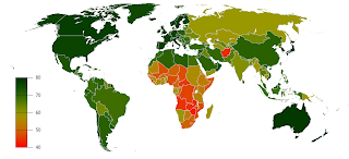
The bright side of life expectancy?

This is a nice graph which illustrates effectively the variation in male life expectancy: how many years a newborn baby boy can currently expect to live.
Actually, no, its a horrible graph because it shows that in many parts of the world, especially sub-Saharan Africa, people don't live much beyond 40, about half what we can expect in rich countries.
For the raw data & the graph for females see here.

Tuesday, December 7, 2010

Visualising Mortality - Hans Rosling

Doing the rounds on the blogworld - quite brilliant!