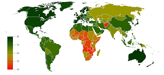
 This is a nice graph which illustrates effectively the variation in male life expectancy: how many years a newborn baby boy can currently expect to live.
Actually, no, its a horrible graph because it shows that in many parts of the world, especially sub-Saharan Africa, people don't live much beyond 40, about half what we can expect in rich countries.
For the raw data & the graph for females see here.